How Visual Hierarchy Can Make or Break Your Sales
How Visual Hierarchy Can Make or Break Your Sales
Have you ever visited a website, immediately felt put off, and then clicked back to search for something else without knowing exactly why?
For years, graphic designers have sought to identify what makes people perceive different web designs as better than others and to control the order in which users see different page elements. Although designers have found this quality – called visual hierarchy – difficult to define, trial and error have revealed certain characteristics of effective visual hierarchy and best design practices to follow to achieve it.
Recently, studies of eye movements among test subjects viewing the same visual materials have demonstrated a solid empirical basis for visual hierarchies.
In this guide, you’ll learn what visual hierarchy is and how incorporating it into your website’s design can drive sales and improve your customers’ experiences.
Key Takeaways
- Visual hierarchy is the order in which users perceive elements on a webpage and a measure of how well those elements enable users to get the information they want.
- Creating an effective visual hierarchy involves using several visual characteristics, such as color, size, and contrast.
- Ecommerce companies can leverage visual hierarchy best practices to create a better user experience and drive sales.

What Is Visual Hierarchy?
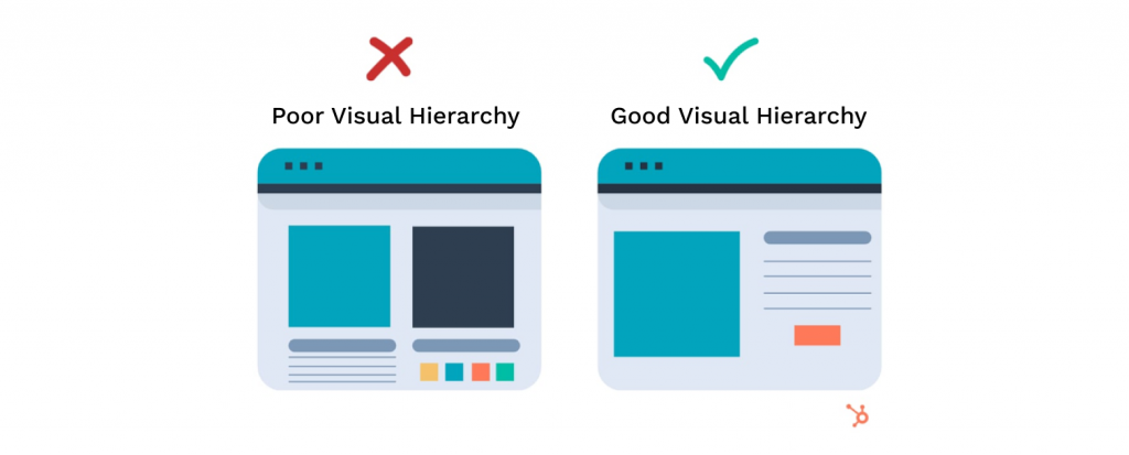
Visual hierarchy refers to the design technique of arranging visual elements to communicate their relative importance and determine the order in which users see them. Designers organize visual elements such as icons, text, pictures, and videos to help users grasp information quickly and easily. The purpose of visual hierarchy is both to make it easier for users to access the information they want and to steer them toward desired actions, such as making purchases or creating accounts.
Designers focus on different visual characteristics to structure hierarchies and user experiences. These typically include:
- Colors: Brighter colors tend to attract attention first.
- Size: Larger page elements stand out.
- Contrast: Dramatic contrasts – such as black and white – catch the eye.
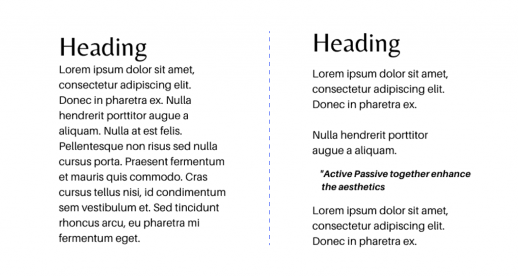
- Whitespace: Refers to clear space around objects or between text that emphasizes their importance.
- Alignment: Elements out of alignment contradict expectations and are more noticeable.
- Proximity: The closeness of elements can suggest their relation.
- Textures, styles, fonts: Each can convey different aesthetic impressions.
Creating Effective Visual Hierarchy
Like all concepts involving visual design and aesthetics, visual hierarchy is partially subjective. However, through testing and experience, designers have developed several guidelines that generally hold true for most users.

- Start with the right questions: Designers must know what they want users to see first and what actions to take.
- Use visual elements to create relative importance: If everything is bold, bright, and large, then nothing stands out effectively.
- Keep it simple: Too much information or an eye-catching picture or video content overwhelms users’ attention and distracts them from desired actions.
Guidelines for Strong Visual Hierarchy on Ecommerce Homepages
Effective homepage visual hierarchy can help ecommerce companies reduce bounce rates, drive sales, and increase margins. Here are six guidelines to help you develop an effective visual experience.
1. Eliminate Elements that Serve No Clear Purpose
When users arrive at your website for the first time, 94% of their overall first impression involves visual design elements. Plus, it takes just 2.6 seconds for users to identify the elements that shape their opinions. Consequently, any degree of visual complexity rapidly becomes a negative influence on first impressions. To avoid this, ensure that the visual elements of your homepage are only what is strictly necessary to communicate brand identity and prompt users to their intended actions.
2. Align Visual Hierarchy with Information Hierarchy
Design ecommerce pages to reflect the information most important to users. For example, the most important information on a homepage includes an identifying logo, a primary value proposition, a navigation menu, and a high-priority call to action (CTA). These should all appear above the fold in larger elements than those that appear when users scroll down the page.
3. Have Separate Transactional and Content Menus
All business websites should contain comprehensive content menus with standard information categories such as Our Story, FAQs, contact options, and social media accounts. However, transactional information like product pages and carts should have visual priority over general business content. To convey this priority, place these links in separate menus and locate the transactional menu in a more prominent and immediately visible position.
4. Use Whitespace to Separate Content Blocks

Whitespace consists of unused margins, gutters, and gaps between page elements. Like punctuation and paragraph breaks create space in text, whitespace helps viewers visually sort information on the page. Use whitespace to visually organize your homepage and create intuitive distinctions between different kinds of information and elements, such as the transactional navigation menu, carts, or offers currently running in ad campaigns.
5. Ensure Clear Visual Distinctions between Promotions and Product Pages
Ongoing promotions and product pages are types of high-value content you want in prominent positions on your homepage. However, you also want to avoid frustrating users with elements they can easily confuse for each other. For example, if you’re currently running a discount promotion on jeans, ensure the element for that promotion is distinct from a link for all jeans in your catalog. You can achieve this through either physical separation on the page or visual distinction indicators such as whitespace or stark border elements.
6. Display Visually Prominent CTAs
As CTAs are one of the most important homepage elements for ecommerce sites, designers should give them the highest-priority placement and leverage multiple visual cues to catch users’ attention. CTAs should be:
- Large and above-the-fold
- Bounded by whitespace
- Strongly color contrasted
- Separate from auto-playing videos or distracting images
CTA content should be clear and concise. Studies show that the optimal CTA length is between 2-4 words. While that leaves little room for detail, it eliminates ambiguity and prompts users to take a specific action.
Ecommerce Profit and Inventory Optimization with Hypersonix
Hypersonix is a machine learning and AI-driven profit and inventory optimization platform for ecommerce companies, providing powerful data insights and recommendations. With capabilities for interpreting pricing, inventory, cost, and risk data, Hypersonix gives decision-makers a powerful edge over the competition.
Schedule a demo today.
Search Resources
Resource Categories
Ready to Let AI Agents Work for Your Margins?
Leading brands are already growing profits on autopilot. Join them.


Trusted by 100+ leading retail brands


